
On this page
Curtain Colours Vastu — Quick Guide
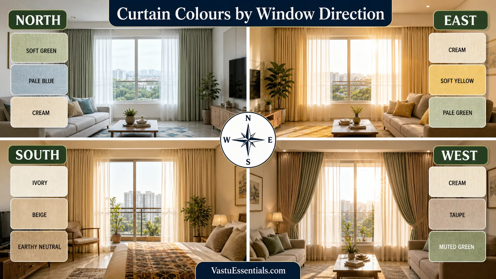
North: soft green, pale blue, cream or off-white.
East: cream, pale yellow, light green or warm white; sheers suit morning light.
South: ivory, beige or muted earthy tones, with lining where heat is strong.
West: cream, taupe, muted green or warm neutrals; layers help afternoon glare.
Bedroom: calm shades plus the opacity needed for sleep and privacy.
Living room: coordinate curtains with walls, sofa, floor and the size of the window.
These are flexible traditional associations, not scientific predictions. A curtain colour does not create luck or misfortune. Start with the room’s light, heat, privacy and function, then use a preferred Vastu colour where it produces a comfortable result.
Why Window Direction Matters for Curtain Colours
Window direction changes how fabric appears. East-facing windows receive morning light that can make cream and pale yellow glow warmly. West-facing windows often receive stronger afternoon glare, making a fabric look brighter and sometimes warmer than it appeared in a shop. South light can add heat, while North light is often softer and cooler.
Direction also changes performance needs. A sunny bedroom may need blackout lining; a shaded living room may need translucent fabric to preserve brightness. A ground-floor window may need more privacy than an upper-floor balcony. Check the orientation using How to Check Directions Correctly, then observe the room in morning, afternoon and evening before ordering fabric.
Curtain Colours by Direction
Curtain Colours for North-Facing Windows
Traditional Vastu often connects North with light greens, pale blues and fresh neutrals. North-facing windows usually receive gentle indirect light, so cream, off-white and muted natural shades can preserve brightness. If privacy is moderate, combine a washable sheer with a light outer curtain instead of using a very heavy dark fabric.
Curtain Colours for Northeast Windows
White, cream, very pale yellow and subtle neutrals keep a Northeast window visually light. This does not mean the curtain must be transparent. Use sufficient opacity for privacy and choose easy-to-clean fabric, especially if the window is near a balcony, prayer corner or busy road.
Curtain Colours for East-Facing Windows
Morning sunlight pairs well with cream, soft yellow, pale green and warm off-white. Sheers can diffuse brightness while allowing an active living or dining area to feel fresh. In bedrooms, add an outer layer if early sunlight interrupts sleep.
Curtain Colours for Southeast Windows
Southeast is traditionally linked with warmth and activity. Restrained peach, warm beige, ivory or gentle earthy accents may suit it better than intense red across a large window. Sun exposure varies by building, so use lining or layered fabric where the room heats up.
Curtain Colours for South-Facing Windows
Ivory, beige, warm cream and muted earthy tones can balance strong warm light. Colour alone does not control heat; fabric weave, lining and how closely the curtain fits the window matter. A layered treatment can preserve daytime softness and provide stronger evening privacy.
Curtain Colours for Southwest Windows
Beige, taupe, muted brown and warm neutral families create a visually grounded treatment. Avoid making a compact bedroom heavy with dense dark brown across the entire wall. A lighter neutral outer drape can retain the earthy character while keeping the room open.
Curtain Colours for West-Facing Windows
West windows often face the strongest practical challenge: hot afternoon light and screen glare. Cream, taupe, muted green and warm neutrals remain versatile, but a thermal lining, blackout layer or blind may be more important than colour. Keep both layers openable so daylight is not blocked all day.
Curtain Colours for Northwest Windows
Off-white, light grey, pale blue, beige and other calm neutrals can suit variable Northwest light. Observe wind and rain exposure near balconies, choose washable material and ensure long curtains do not obstruct ventilation.
Master Direction Table
| Direction | Suggested colour families | Light / heat consideration | Practical curtain approach |
|---|---|---|---|
| North | Soft green, pale blue, cream | Gentle, cooler light | Light outer drape or sheer + standard layer |
| Northeast | White, cream, pale yellow | Preserve brightness | Visually light, washable fabric |
| East | Cream, soft yellow, pale green | Bright morning light | Sheer by day; outer layer for sleep |
| Southeast | Warm beige, ivory, soft peach | Possible warmth and glare | Restrained shade with lining if needed |
| South | Ivory, beige, earthy neutral | Warm light and heat | Lined or layered treatment |
| Southwest | Taupe, beige, muted brown | Can appear visually heavy | Grounded but not excessively dark |
| West | Cream, taupe, muted green | Strong afternoon glare | Sheer + blackout or heat-control lining |
| Northwest | Off-white, light grey, pale blue | Variable light and weather | Easy-care, movable layers |
Living Room Curtain Colours According to Vastu
Living-room curtains should connect the largest visual elements: walls, sofa, rug, flooring and daylight. For large windows, a quieter curtain usually ages better than an oversized print. For small windows, a curtain close to the wall tone can reduce visual fragmentation and make the opening feel larger.
In open-plan apartments, repeat one undertone across living and dining areas rather than selecting unrelated curtains for each zone. A warm cream may connect beige flooring and a green sofa, while muted blue can complement cool grey walls. Layered curtains provide privacy without sacrificing daytime light. Coordinate the full layout with Living Room Vastu.
Bedroom Curtain Colours According to Vastu
A bedroom needs visual calm, privacy and control over unwanted light. Cream, beige, muted sage, dusty blue, warm grey and soft rose can work when coordinated with bedding and walls. Direct morning sun or streetlights may justify blackout fabric even if a sheer treatment looks attractive in daytime.
Blackout describes performance, not colour: blackout curtains can be cream, green or blue. Open them during the day where practical so the bedroom receives daylight and ventilation. Review bed, windows and storage together in the Bedroom Vastu and Master Bedroom Vastu guides.

Curtain Colours for Children’s Bedrooms
Choose cheerful but controlled colour: pale green, gentle blue, cream, soft yellow or a restrained print can support both study and sleep. Avoid turning every surface into a strong accent. Easy-to-clean fabric is valuable, and blackout lining can help when outdoor lighting or early sun interrupts sleep. See Children’s Room Vastu.
Curtain Colours for Study Rooms & Home Offices
Glare control matters more than a symbolic shade when a screen faces the window. Calm neutrals, muted green, soft blue and warm white can create a quiet background for video calls and concentration. Use adjustable layers so daylight can be redirected without making the workspace dark. Related guidance: Study Room Vastu and Home Office Vastu.
Curtain Colours for Dining Areas
Warm cream, beige, muted green and soft earthy shades can make dining feel welcoming. In an open plan, connect the dining curtain with the living-room palette rather than creating another colour theme. Keep fabric away from cooking flames and choose washable material where dining is close to the kitchen. See Dining Room Vastu.
Curtains for Pooja Rooms and Prayer Corners
Use light, easy-to-clean fabric that maintains visual simplicity. Cream, off-white and soft yellow may work, but daylight, ventilation and safe distance from lamps or flames are more important than a rigid colour rule. Avoid unsupported religious claims; use the curtain for respectful privacy and practical dust control.
Curtain Colours for Small Apartments & Flats
Light curtains close to the wall colour help a compact flat feel continuous. Hang the rod higher where construction permits, measure accurately and avoid splitting a small studio into too many unrelated colours. A pale sheer across the window and a slightly deeper outer drape can provide depth without crowding the room.
Low ceilings benefit from simple vertical folds and minimal borders. Small windows need correctly proportioned fabric rather than oversized decorative pelmets. See Apartment Vastu for whole-flat decisions.
Curtain Choices for Rental Homes
Use existing rods and reversible fittings permitted by the lease. Select washable, reusable lengths that can adapt to a future home; hemming tape or adjustable hooks may help without permanent alteration. Before spending heavily, verify measurements, rod strength and owner restrictions. More reversible ideas appear in Rental Home Vastu.
Choosing the Right Curtain Fabric
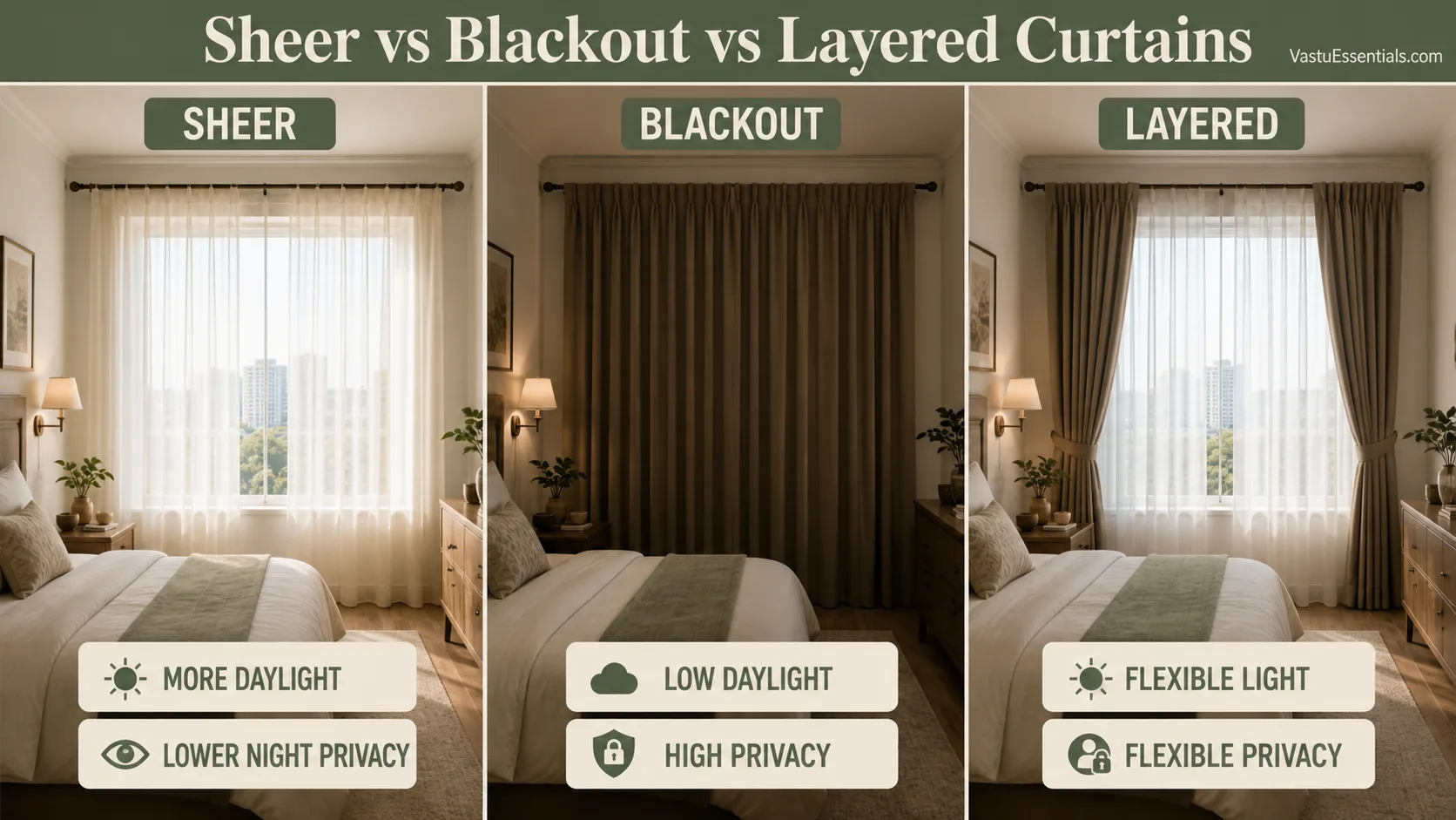
Cotton is breathable and familiar but may crease or shrink depending on construction. Linen and linen-textured fabric gives relaxed texture and beautiful daylight diffusion, though pure linen needs care. Sheers preserve light but offer limited night privacy. Blackout fabric supports sleep and glare control, although quality and drape vary. Polyester blends can be durable, washable and budget-friendly. Layered curtains combine a sheer inner panel with an opaque outer drape for flexible use.
Colour and performance are separate decisions. Two beige curtains can behave very differently if one is an open-weave sheer and the other is lined blackout fabric. Ask for a sample, inspect it against the actual window and confirm cleaning instructions.
Sheer vs Blackout vs Layered Curtains
| Curtain type | Daylight | Privacy | Heat / glare control | Best use |
|---|---|---|---|---|
| Sheer | High | Low at night | Low | Daytime living areas |
| Standard curtain | Medium when open | Medium to high | Moderate | General rooms |
| Blackout | Very low when closed | High | High glare control | Bedrooms and media rooms |
| Sheer + blackout | Adjustable | Adjustable | Flexible | Bedrooms and sunny living rooms |
How to Match Curtain Colours With Walls
White walls
Use cream, sage, pale blue, taupe or a restrained warm accent.
Cream walls
Choose tonal beige, muted green, dusty blue or warm white.
Beige walls
Try ivory, taupe, olive-grey or a lighter beige.
Grey walls
Warm grey, cream, muted blue or soft green prevents a cold result.
Green or blue walls
Use warm white, beige or a quieter tonal version of the wall.
Warm-toned walls
Ivory, sand or restrained earthy shades keep the room balanced.
Tonal matching uses a lighter or deeper version of the wall colour and helps small rooms feel continuous. Contrast adds interest but should repeat elsewhere, perhaps in cushions or art. Always assess the combination in the room’s daylight. The Vastu Colors for Home guide provides a broader palette framework.
Are These Curtain Colours Suitable?
White and cream
Fresh and versatile, especially for sheers and small rooms. Consider washability, privacy and glare.
Grey
Soft or warm grey can look calm and modern. Very dark cool grey may make a shaded room feel dull.
Black
Useful as a selective blackout layer, but visually heavy across large windows in small spaces. It is not automatically “bad.”
Red
Strong red can become intense under warm sunlight. Use a muted red, border or accent when it fits the room rather than treating it as a universal rule.
Blue and green
Pale blue and muted green are restful and versatile. Check their undertones against wall paint and evening lighting.
Yellow
Soft yellow can brighten East or shaded spaces. Highly saturated yellow may dominate a large window.
Brown and beige
Beige is adaptable; brown works best when light and room size can support its visual weight. Texture can stop a neutral scheme from feeling flat.
15 Common Curtain Colour & Placement Mistakes
1. Ignoring daylight
Store lighting does not show how fabric behaves at home.
2. Darkening a dim room
Very dark fabric can reduce an already limited sense of light.
3. Missing privacy needs
A sheer alone may become transparent after dark.
4. Ignoring West heat
Colour cannot replace useful lining or layers.
5. Matching everything
Exact repetition can look flat rather than coordinated.
6. Competing colours
Too many bold surfaces create visual noise.
7. Curtains too short
Incorrect length can make the window look unfinished.
8. Blocking ventilation
Heavy fabric should remain movable and clear of airflow.
9. Appearance only
Fabric performance matters as much as colour.
10. Ignoring washability
Dust and cooking exposure demand practical care.
11. Blackout everywhere
Not every room needs permanent darkness.
12. Ignoring function
A study, bedroom and dining area have different needs.
13. Rigid colour rules
Do not sacrifice comfort for a directional preference.
14. Fear-based choices
No curtain colour predicts misfortune.
15. Damaged curtains
Repair or clean dusty, torn and difficult-to-use fabric.
Curtain Selection Checklist
- ☐ Window direction identified
- ☐ Natural light level checked
- ☐ Afternoon heat considered
- ☐ Privacy requirement considered
- ☐ Room function identified
- ☐ Wall colour considered
- ☐ Furniture colour considered
- ☐ Fabric opacity selected
- ☐ Sheer / blackout requirement decided
- ☐ Curtain length measured
- ☐ Cleaning and washability considered
- ☐ Rental restrictions checked if applicable
- ☐ Vastu colour preference considered where practical
Frequently Asked Questions
Which curtain colour is best according to Vastu?
There is no single best shade for every home. Cream, off-white, beige, pale green and muted blue are versatile, but window direction, room use, daylight, privacy and existing finishes should guide the final choice.
Which curtain colour is best for north-facing windows?
Soft green, pale blue, cream, off-white and light neutral shades are commonly associated with North. Choose enough opacity for privacy without unnecessarily reducing gentle daylight.
Which colour is suitable for east-facing windows?
Cream, soft yellow, pale green and warm off-white work well with morning light. Sheers can soften brightness while keeping the room fresh.
What curtains work for south-facing windows?
Ivory, beige, taupe and muted earthy shades are practical. Where heat is strong, use lined or layered curtains rather than choosing colour alone.
Which colours suit west-facing windows?
Cream, taupe, warm neutrals and muted green can suit West windows. Layered or blackout options help manage strong afternoon glare and heat.
Which curtain colour is recommended for northeast?
White, cream, very pale yellow and light neutrals are common traditional preferences. Keep the treatment visually light while still meeting privacy needs.
Which colours work for southwest windows?
Beige, taupe, muted brown and earthy neutral families can create a stable visual treatment. Practical heat control and room coordination remain important.
Which curtain colour is best for bedrooms?
Calm shades such as cream, beige, muted green, dusty blue, warm grey or soft rose often support a restful look. Select opacity according to streetlights and sleep needs.
Which curtain colour is best for living rooms?
Warm neutrals, ivory, soft green, light blue and restrained earthy shades are versatile. Coordinate the curtain with walls, sofa, flooring and daylight.
Are white curtains suitable according to Vastu?
Yes. White and off-white curtains can look fresh and bright, especially as sheers. Choose washable fabric and add an outer layer where privacy or glare control is needed.
Are grey curtains suitable?
Yes. Warm or soft grey can be calm and modern when the room has enough light. Avoid making an already dim room colder with very dark grey.
Should black curtains be avoided?
Black is not automatically unsuitable. It offers strong light control but can feel heavy in small or dark rooms. Use it selectively, often as a blackout layer behind lighter curtains.
Can red curtains be used?
Red can work as a restrained accent in a room with a simple palette. Large bright-red surfaces may feel visually intense, particularly in sunny rooms or bedrooms.
Are blackout curtains suitable for bedrooms?
Yes. Blackout curtains are useful for streetlights, shift workers and strong morning sun. Open them during the day for ventilation and daylight when practical.
Should curtain colour match the wall?
It does not need to match exactly. A related lighter or darker tone creates continuity, while controlled contrast can add interest without fragmenting the room.
Related Guides
Living Room Vastu
Coordinate windows with seating, light and privacy.
Master Bedroom Vastu
Plan sleep, bed position and window treatment together.
Vastu Colors for Home
Build a consistent whole-home palette.
Windows Vastu
Review daylight, airflow and window placement.
Apartment Vastu
Adapt colour guidance to fixed flat layouts.
Complete Home Planning
Connect directions, rooms and finishes.
Conclusion
Curtain colours Vastu works best as a flexible design framework. Identify the window direction, but also observe daylight, heat, privacy and room function. Then choose a colour family that coordinates with walls and furniture and a fabric that performs properly.
A successful curtain is comfortable to use, simple to clean and appropriate throughout the day. Traditional colour preferences can support the decision where practical; they should never create fear or override sleep, safety, ventilation and daily comfort.