Quick Vastu grid
North / East
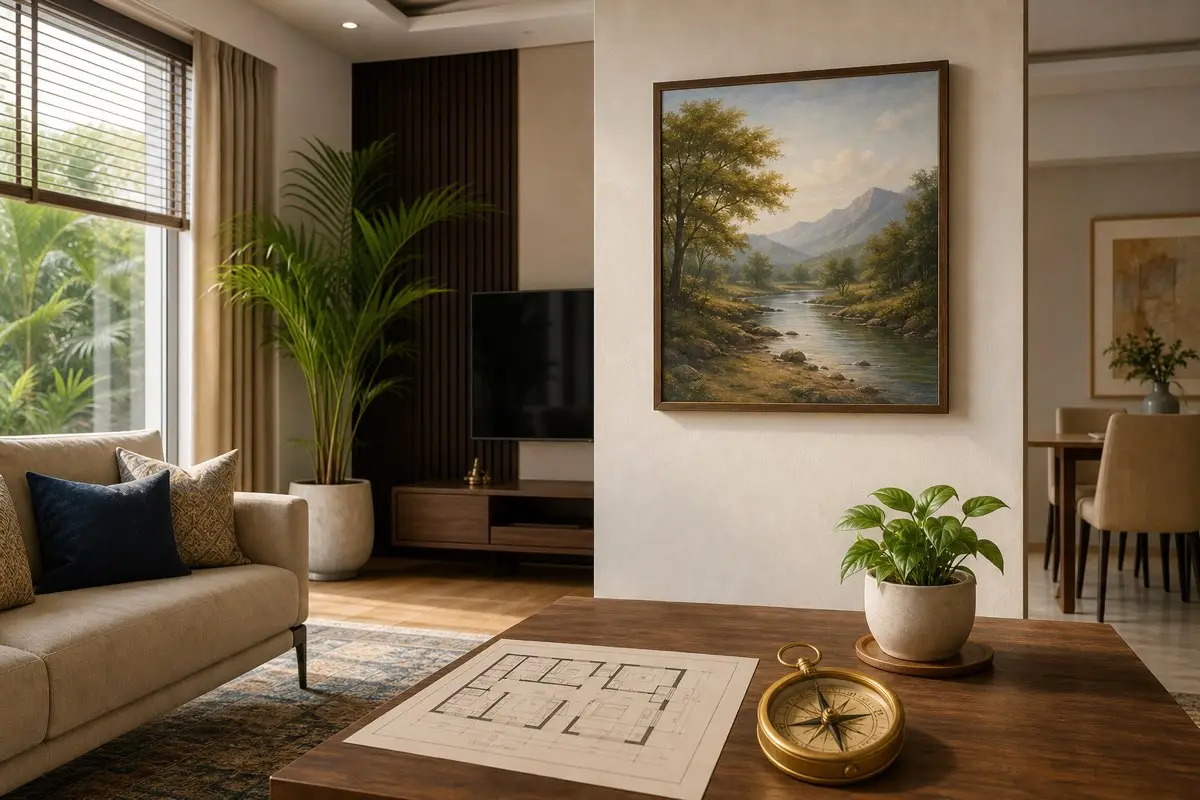
Calm nature, growth, learning, fresh landscapes, and light artwork can suit these bright zones.
Living room
Use welcoming art that feels open, positive, and easy for guests and family to view.
Avoid
Avoid sad, violent, lonely, broken, sinking, or aggressive images in daily-use rooms.
Why wall paintings matter in Vastu
A wall painting is not just decoration. It becomes part of the room’s daily visual language. Family members see it while entering, eating, resting, studying, or working. In Vastu, repeated visual impressions can support calmness, confidence, and clarity, or they can make a space feel heavy and restless.
Modern Indian homes often use framed art, canvas prints, family photos, textured panels, metal art, and digital prints. The best artwork should match the room, direction, natural light, and emotional purpose of the space. A premium home does not need too many pictures. It needs the right picture in the right place.
Best subjects for wall paintings
Nature scenes, sunrise, greenery, calm rivers, mountains, lotus, gentle birds, family-friendly abstract art, and balanced geometric designs are usually safe choices. They feel calm and uplifting without forcing a religious or dramatic mood. For children’s rooms, use cheerful learning-related art, soft animals, or creative themes.
For the living room, choose art that welcomes people. For the dining area, choose abundance, harmony, fruits, greenery, or warm family-friendly themes. For a study, choose clarity and focus rather than loud entertainment imagery. For the bedroom, choose soft pairs, calm landscapes, or gentle patterns instead of energetic or lonely images.
Direction-wise artwork ideas
North can support growth, movement, and career-related symbolism, so light landscapes, flowing forms, and calm blue-green tones can work. East is linked with sunrise, health, learning, and freshness, so morning light, nature, and positive beginnings suit it. North-east should remain clean and peaceful, so avoid heavy or dark art there.
South and south-west walls can hold heavier frames or grounded artwork when the room needs stability. West can handle creative, balanced, or family-oriented artwork. Always check the real wall, furniture, and room use before applying any rule blindly.
Room-wise placement
In the living room, avoid placing disturbing artwork where it becomes the first thing guests see. In the bedroom, avoid single lonely figures, stormy oceans, war scenes, and sharp imagery. In the dining room, avoid images that feel empty, dry, or depressing. In the study, avoid distracting celebrity posters or chaotic patterns near the desk.
If a pooja area is nearby, keep the artwork respectful and uncluttered. If the wall is already busy with shelves, TV, clocks, and switchboards, use fewer frames. Negative wall clutter can affect the look of the room more than one imperfect direction.
Images to avoid
Avoid paintings of war, crying faces, broken objects, sinking ships, wild aggression, dark forests, dried trees, lonely roads, and disturbing abstract forms. Some people enjoy dramatic art, but daily home spaces usually benefit from emotional steadiness. Keep intense artwork for private collections, not common family zones.
Also avoid damaged frames, cracked glass, faded prints, dusty artwork, and pictures hung crooked for months. A positive subject loses its value when neglected. Clean and align frames regularly.
Colours and frame choices
Soft greens, blues, creams, warm neutrals, muted gold, earthy browns, and balanced pastels work well in most homes. Bright red, black, and very dark palettes should be used carefully because they can dominate a small room. The frame should suit the furniture finish and wall colour.
Wooden frames feel warm, metal frames feel modern, and frameless canvas can look clean. Choose one language for a wall instead of mixing too many frame styles. Visual harmony is also a form of Vastu.
Apartment and rental home tips
In rental homes, use lightweight frames, removable hooks, and simple canvas prints. Avoid drilling too many holes without permission. If a direction is not ideal, choose emotionally positive artwork and keep the area clean.
In apartments, the main wall may be dictated by furniture. Work with the available wall rather than forcing art into awkward corners. If the entrance faces a blank wall, a calm painting can make arrival feel better immediately.
No-demolition remedies
If you already have artwork that feels heavy, remove it for a week and observe the room. Replace it with a lighter subject, better lighting, or a simple plant nearby. This is one of the easiest Vastu corrections because no construction is needed.
If a wall feels crowded, reduce the number of frames. If the room feels dull, add one brighter image rather than many small items. If the bedroom feels restless, choose softer artwork and avoid bright visual noise near the bed.
Real-life Indian examples
A Mumbai apartment living room with one main sofa wall can use a single calm landscape instead of a gallery of unrelated prints. A Chennai dining corner can use fruit, greenery, or warm abstract art to make meals feel welcoming. A Bengaluru home office can use one focused, clean print rather than a wall full of distractions.
In a villa or independent house, larger walls can support bigger art, but proportion still matters. A tiny frame on a huge wall looks lost. A huge dark painting in a narrow flat corridor feels heavy. Scale is part of good design and good Vastu.
How to choose art before buying
Before buying a painting, take a photo of the wall in daylight and evening light. Check the wall width, sofa height, curtain colour, floor finish, and nearby décor. A painting that looks beautiful in a store can look too dark or too small at home. If possible, use paper tape to mark the approximate frame size on the wall before ordering.
Ask three simple questions: does this image feel peaceful, does it match the purpose of the room, and will I still like seeing it every day? If the answer is uncertain, choose a calmer subject. Vastu-friendly art should support the room’s emotion, not just fill empty space.
Maintenance and seasonal review
Review wall paintings once every six months. Clean dust, straighten frames, replace faded prints, and remove artwork that no longer feels right. During festivals or house cleaning, many families refresh curtains and cushions but forget wall décor. A small refresh can change the entire room mood.
If you are preparing the home for sale or rental, choose neutral, bright, positive artwork. It helps rooms photograph better and feel larger. This is not only Vastu-friendly; it is also good presentation for modern property buyers.
Do’s and don’ts table
| Do | Don’t |
|---|---|
| Check direction with the full room layout and daily use. | Follow a rule blindly while ignoring safety, comfort, or scale. |
| Keep the area clean, bright, maintained, and proportionate. | Keep broken, dusty, unsafe, or emotionally heavy items. |
| Use simple no-demolition corrections first. | Rush into expensive changes for movable décor or appliances. |
Expert checklist before final placement
Before finalising the placement, stand at the room entrance and look at the full scene. Check whether the item looks balanced with the wall, furniture, window, lighting, and movement path. Then use a compass or building plan to confirm the direction. This two-step method prevents the common mistake of checking direction but ignoring how the room actually feels.
Next, test daily use. Can the family clean the area easily? Does the placement create heat, water, noise, glare, clutter, or awkward movement? Does it make the room feel premium and peaceful, or does it make the space look crowded? If a placement fails these practical tests, use a simple correction before considering any major change.
Finally, review the placement after one week. Homes are living spaces, not showroom displays. A Vastu-friendly choice should continue to feel comfortable during busy mornings, cooking time, cleaning time, guest visits, and night use. If it creates stress in daily life, adjust it calmly.
Frequently asked questions
Which painting is best for living room as per Vastu?
Calm nature, greenery, sunrise, gentle abstract art, and welcoming family-friendly subjects are usually good choices.
Which paintings should be avoided at home?
Avoid sad, violent, lonely, broken, sinking, dry, or aggressive images in common and restful rooms.
Can family photos be placed in the living room?
Yes, if they are happy, respectful, well-framed, and not overcrowded.
Is abstract art okay in Vastu?
Yes, when the colours and feeling are calm, balanced, and not disturbing.
Recommended internal links
Living Room Vastu
Read the full guide here: Living Room Vastu.
Bedroom Vastu
Read the full guide here: Bedroom Vastu.
Vastu Colours for Home
Read the full guide here: Vastu Colours for Home.
Clock Vastu
Read the full guide here: Clock Vastu.
Final thoughts
Good Vastu works best when it improves the way a home actually feels and functions. Choose the right direction where possible, but also respect safety, cleanliness, proportion, light, movement, and maintenance. Small corrections often create a big improvement without renovation.