Why kitchen colours matter in Vastu
The kitchen is one of the most active areas in an Indian home. It handles heat, water, storage, food, family routine, and daily movement. A kitchen colour should therefore feel clean, bright, warm, and easy to maintain. In Vastu, the kitchen is strongly connected with the fire element, so colours that support controlled warmth are often preferred over colours that feel dull, cold, or visually heavy.
For modern homes, colour selection also affects how spacious the kitchen feels. A compact 2BHK kitchen with poor natural light may look smaller if every surface is dark. A large villa kitchen may handle deeper accents more comfortably. This is why Vastu colour advice should be applied with room size, direction, ventilation, cabinet finish, and lighting in mind.
The goal is not to create fear around colour. Paint can be changed, cabinet films can be updated, and accents can be softened. Use this guide as a practical checklist, not a rigid rulebook.
Quick table of contents
Best shades
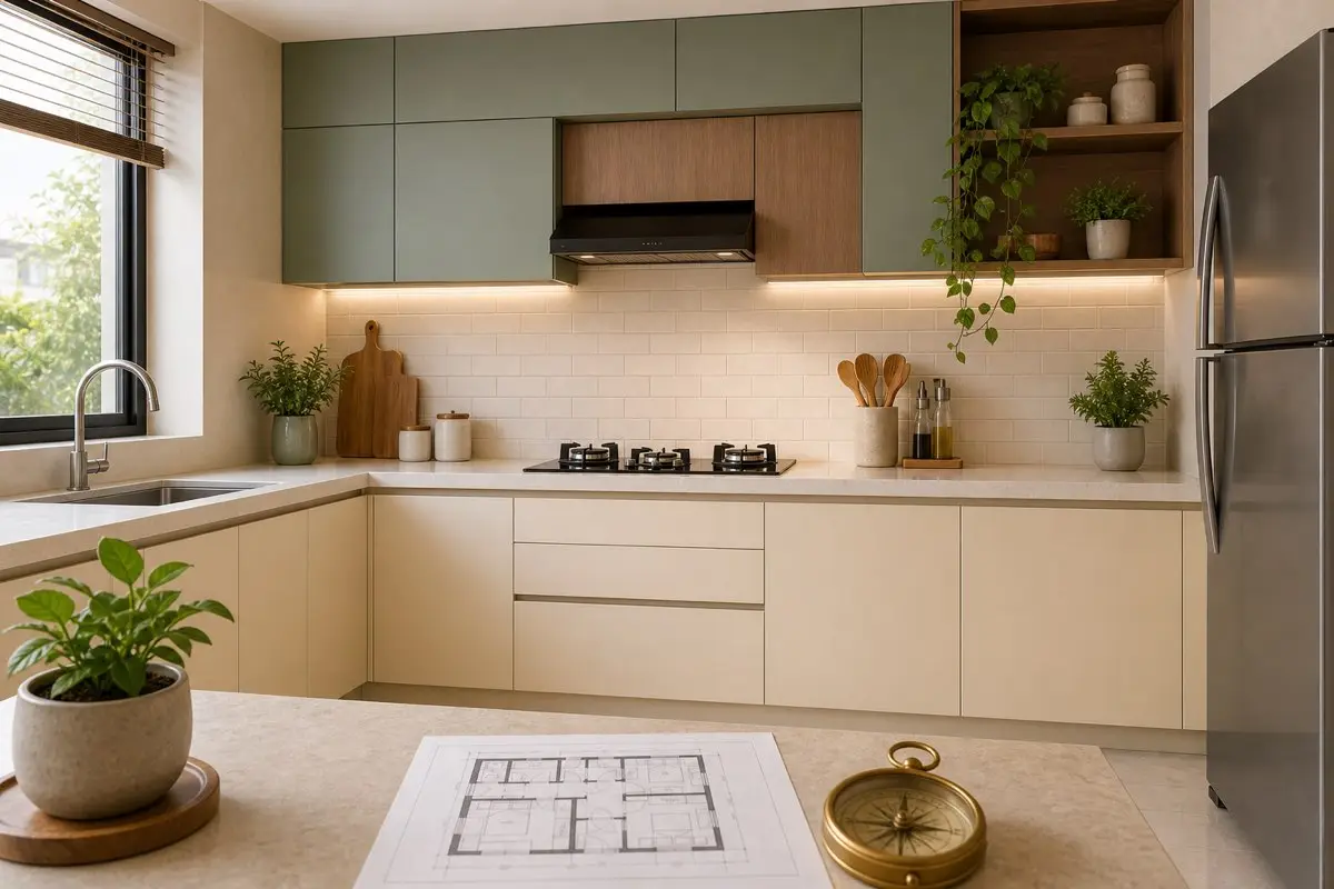
Warm white, cream, beige, soft yellow, peach, light terracotta, sage, and wood tones.
Use carefully
Strong red, dark grey, black, deep blue, and high-gloss intense colours in small kitchens.
Best fix
Use lighting, backsplash, mats, plants, cabinet film, and accents before repainting everything.
Best kitchen colours as per Vastu
Soft yellow is traditionally loved for kitchens because it feels sunny, warm, and connected with nourishment. Cream and warm white are excellent for apartments because they make the kitchen look clean and spacious. Peach, light orange, and mild terracotta can support the fire element without becoming too intense. Beige and wood tones create a grounded, premium look.
Sage green and soft mint are increasingly popular in modern kitchens. They can work beautifully when balanced with cream or warm white. Green gives a fresh, natural feeling and can soften the heat-heavy mood of a kitchen. The key is moderation. A full dark green kitchen may look heavy, but sage upper cabinets with cream lower cabinets can feel elegant.
If you want a premium look, use a 70-20-10 approach: 70% calm base colour, 20% warm or natural accent, and 10% metal, wood, or contrast detail. This keeps the kitchen sophisticated without visual clutter.

Direction-wise kitchen colour guide
For a south-east kitchen, warm colours such as cream, peach, soft orange, light terracotta, and warm beige are commonly preferred because south-east is associated with fire. Avoid turning the entire kitchen bright red. Red can work as a small accent, but too much red may feel aggressive in daily use.
For an east-facing kitchen or a kitchen receiving strong morning light, warm white, pale yellow, and fresh natural tones can work well. For a north or north-east influenced kitchen, keep the palette light and clean. Avoid making these zones too heavy with dark stone, black cabinets, or cluttered storage.
For west or north-west kitchens, beige, cream, light grey, wood, and muted green can be practical. For south or south-west kitchens, avoid excessive black and very heavy colours. Use grounded neutrals, but keep enough brightness so the room does not feel closed.
Cabinet colours for modular kitchens
Cabinets cover a large visual area, so they influence the kitchen more than small décor. Cream, ivory, beige, light wood, pale yellow, and sage green are safe choices for many Indian homes. If you want a modern contrast, use darker colours only on lower cabinets and keep upper cabinets lighter. This makes the room feel taller and airier.
High-gloss finishes reflect light, but they also show fingerprints. Matte finishes look premium but can show oil marks if the material is poor. Choose a finish you can maintain. Vastu-friendly colour is not useful if the surface always looks greasy or scratched.
Black cabinets can look dramatic in large kitchens with good ventilation and daylight, but they are risky in small flats. If you love black, use it for handles, appliances, a small backsplash detail, or one accent wall rather than the full kitchen.
Tiles, backsplash, and countertop colours
Kitchen tiles should be easy to clean first. White subway tiles, cream ceramic tiles, beige stone-look tiles, and soft patterned backsplashes work well. Avoid very busy tiles behind the stove because they collect visual noise along with oil and spice stains. A calm backsplash makes the kitchen look larger and cleaner.
For countertops, light granite, quartz, beige, off-white, and soft grey are practical. Very dark counters can work if the cabinets and walls are light. Avoid choosing a counter only for trend value. It must handle turmeric, oil, heat, water, and daily cleaning.
Kitchen colours for small apartments
Small Indian apartment kitchens need brightness. Use warm white, cream, pale yellow, light beige, or sage as the main colour. Keep the ceiling white or near-white. Use under-cabinet lighting if the counter looks dark. A small kitchen can feel premium when the colour palette is simple and surfaces are clear.
Avoid too many contrasting laminates. A kitchen with dark lower cabinets, bright upper cabinets, patterned backsplash, coloured appliances, and many magnets may feel restless. Keep the main palette limited to two or three colours. The simpler the palette, the bigger the kitchen feels.
Common kitchen colour mistakes
The first mistake is choosing dark colours because they look premium in online photos. Many showroom kitchens are large and professionally lit. Your actual flat may have one small window and warm tube lighting. Always test colour in your home light before finalising.
The second mistake is ignoring the stove and sink. A colour may be beautiful, but if it hides stains badly or makes water marks obvious, maintenance becomes frustrating. The third mistake is using too much red. Fire-supportive does not mean everything must be red. Balance is more important.
The fourth mistake is ignoring nearby rooms. In open kitchens, the kitchen colour should connect with the living and dining palette. If the living room is calm and the kitchen is visually loud, the whole home feels divided.
No-renovation colour remedies
If your kitchen colour is not ideal, you do not need immediate renovation. Use warm lights, washable cabinet film, a simple backsplash sticker, wooden trays, cream mats, lighter curtains, and uncluttered storage. A plant near the window can soften a cold kitchen, but do not block ventilation.
If the kitchen is too dark, increase light reflection with cream accessories, lighter containers, and better lighting. If it is too red or intense, add beige, wood, and soft neutral accents. If it feels too cold, add warm bulbs and natural textures. These small remedies are affordable and rental-friendly.
Internal guides to read next
For the full cooking layout, read Kitchen Vastu. If you are checking the whole home, start with Home Vastu and Apartment Vastu. To understand direction correctly, use How to Check Directions Correctly and Direction Vastu.
For appliance placement, continue with Gas Stove Vastu, Refrigerator Vastu, and Microwave Oven Vastu. For wider colour planning, see Vastu Colours for Home. If your kitchen cannot be changed, read Vastu Remedies Without Demolition. For common doubts, visit the Vastu FAQ or go back to the VastuEssentials homepage.
Quick buying and painting checklist
| Area | Good choice | Use carefully |
|---|---|---|
| Walls | Cream, warm white, pale yellow | Dark grey, black, intense red |
| Cabinets | Sage, beige, light wood, ivory | Full dark colours in small kitchens |
| Backsplash | Easy-clean light tiles | Very busy patterns behind stove |
| Accents | Wood, brass, soft terracotta | Too many competing colours |
Kitchen Colours Vastu FAQ
Which colour is best for kitchen as per Vastu?
Soft yellow, cream, warm white, light orange, peach, beige, and gentle green are commonly used because they feel clean, warm, and practical for cooking spaces.
Which colour should be avoided in kitchen?
Avoid making the full kitchen very black, very dark grey, or visually heavy. Small accents are fine, but large dark surfaces can make compact kitchens feel closed.
Is green colour good for kitchen Vastu?
Yes, soft green or sage green can work well as an accent or cabinet colour, especially when balanced with cream, white, or wood.
Can we use blue in kitchen?
Light blue can be used carefully, but very strong blue near the fire zone may feel cold. Balance it with warm lighting or wood.
What colour is best for south-east kitchen?
South-east kitchens often work well with warm neutrals, cream, peach, soft orange, light terracotta, and controlled red accents.
What colour is good for small apartment kitchens?
Cream, warm white, beige, light sage, and pale yellow help small kitchens feel larger and brighter.
Can kitchen cabinets be black?
Black cabinets can look premium in large, bright kitchens, but avoid heavy all-black designs in small or poorly lit kitchens.
Should kitchen tiles follow Vastu colours?
Tiles should be easy to clean first. Choose light, warm, or neutral colours that support brightness and hygiene.
Is red good for kitchen?
Small red accents can support the fire element, but too much red can feel intense. Use it carefully.
How can I fix wrong kitchen colours without renovation?
Use curtains, mats, backsplash stickers, lighting, plants, cabinet film, or décor accents to soften the palette without demolition.
Conclusion
The best kitchen colour is the one that supports warmth, hygiene, brightness, and daily comfort. For most modern Indian homes, cream, warm white, beige, soft yellow, peach, light terracotta, sage green, and wood tones are practical and Vastu-friendly. Avoid making compact kitchens too dark or visually heavy. Start with small corrections, keep the fire zone clean, and choose colours that make cooking feel peaceful rather than stressful.